Take your powerpoint slides to the next level!
Let’s just clear the air and admit most presentations look bad. It’s an unfortunate thing, but it’s true. Most people who make slide-based presentations (i.e. PowerPoint) aren’t skilled at design (I’m not), have no formal PowerPoint training (I don’t), and only know as much as they need to in order to make presentations (also me). On top of that, often times you’re strapped for time and aren’t overly concerned with making a knockout presentation so long as it’s done (think conferences, lectures). I get it, and that’s fine. A bad-looking powerpoint doesn’t mean the presentation is bad (speaking/content matters!), neither does a good-looking presentation automatically make a presentation good.
Some years ago I wanted more out of powerpoint so that I can make ideas look in presentations the way I saw them in my head. I wanted content to flow visually the way they flowed conceptually, and that took animations, etc. Since then I eagerly looked on to any new features PowerPoint would get in the hope it would make it easier for my presentation to look and move exactly how I wanted, and bonus points if it’s easy to do. Well, these features have existed since 2016 and not a single academic I’ve spoken to has ever heard of or used them. I jumped on these new tools immediately and continue to perfect the way I use them. You might not have ever seen me present at my university or a conference, but I can assure you the techniques presented here can elevate your presentations with some practice. Scroll to the bottom for some real- world examples I’ve used in the wild.
Caveat: The techniques presented here are biased towards sighted individuals. In the future, I plan on working towards techniques that improve accessibility.
Enough of the preamble, let’s get to it!
Crop to shape
You probably haven’t noticed that the Crop icon has a dropdown menu with some extra options. Well, one of them is Crop to shape. I only use rounded rectangles in my
recent presentations, so having rectangular objects with sharp corners breaks the aesthetic. Crop your images to whatever shapes and have them fit in better with everything
else. I typically crop to a rounded rectangle.
Stock icons
A few versions ago, Microsoft introduced a large repository of icons you can freely insert into presentations. If you have a recent-ish version of Powerpoint, you should
have access to it under Insert >> Icons. These icons are flat, minimal, and perfect for supplementing or replacing text. They are vector graphics (grow/shrink without
pixelation) and can be recolored in Powerpoint, which makes them super versatile.
Morph
Morph is the single most important feature in powerpoint (available in updated 2016 versions). That’s not hyperbole. It’s the most important change you can make to your presentations. Hard to explain what exactly it does, but Morph is a slide transition option that “guesstimates” how objects are moving between two slides and tries to make the smoothest animation of those elements changing from slide 1 to slide 2. There’s a lot of nuance to getting this right, making it look good, making it look effective rather than gratuitous, and making it work correctly. In many simple cases it’s pretty easy to use. You can access this with Transitions >> Morph. Morph lets me reuse visual elements between slides in a way
where the audience can see a visual connection between content spread across different slides. This really helps convey conceptual flow via visual flow.The possibilities
of what you can do with Morph are only limited by your creativity. Keep in mind that using Morph in presentations often inflates your slide count and your slides:time
ratio will get skewed. Like all features in Powerpoint, you can lean into this too much and make your presentation very tacky, so a lot of practice and discipline will
inform you when and how to implement it.
Basics
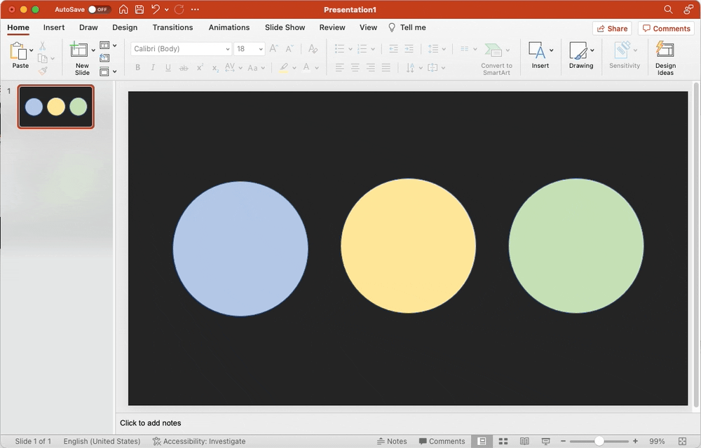
A simple explanation that you can follow allong with is to make three circles and give them different colors. Duplicate the slide and move the circles around, or change their sizes. Change the Transition of the 2nd slide to Morph and you will see how powerpoint smoothly moves/resizes the circles between the two.
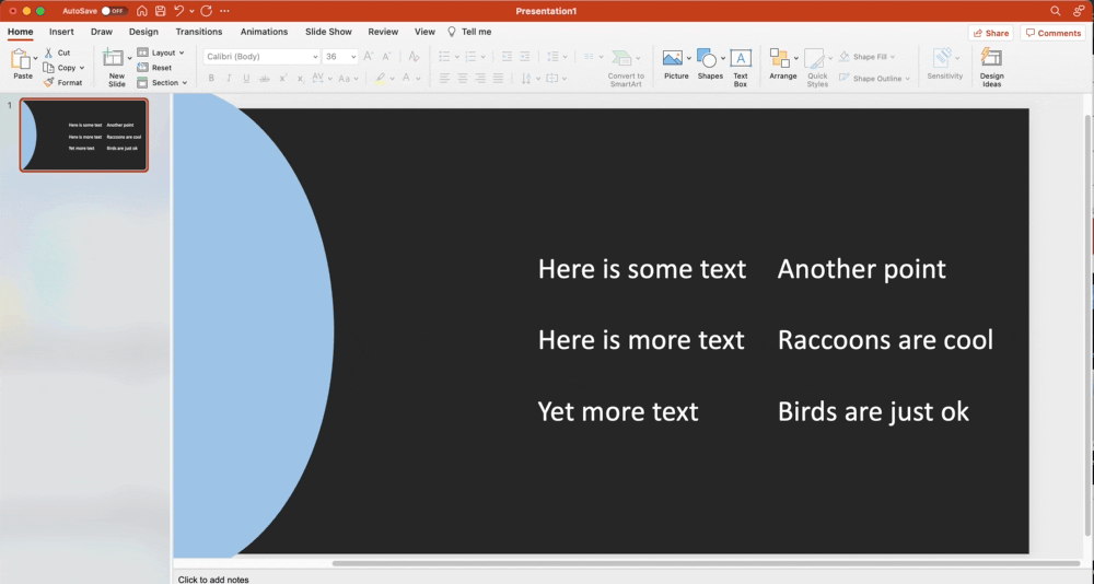
Scroll
A simple implementation of Morph would be to have scrolling text, kind of like a smartphone. Create one slide and put text on it somewhere. Create another textbox out of the viewable area of the slide. Duplicate this slide and in the second slide, move the first text box out of frame. Now, move the 2nd text box (that was out of frame in slide 1) into the viewable area. When you change the Transition to Morph, it will have the text boxes glide between their two positions.
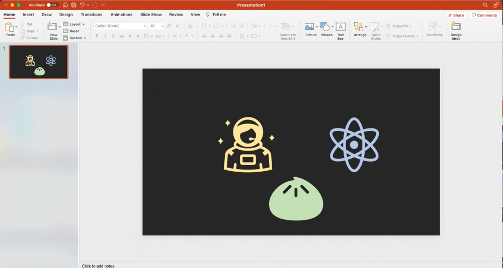
Push
Another simple implementation of Morph is to have objects move in perpendicular patterns. In the example below, an object rises up from the bottom and “pushes” the
other objects apart such that they glide offscreen. Like we did in the scrolling example, the bun is out of frame in Slide 1 and the astronaut/atom are out of frame in Slide 2. Objects that were not in the previous slide appear in a “Fade” animation pattern in the new slide, like the text in the example.
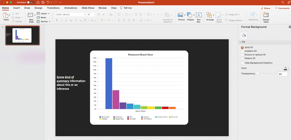
4. Focus blur
This is a technique I constantly use to make sure my audience only pays attention to the things I want them to. You can add Picture Format >> Artistic Effects >> Blur to an image
so your audience literally cannot focus on it until you want them to. I often pair this with a translucent box matching the slide color to darken the image as well,
so it’s not so bright. You’ll need to make a copy of your object, add the Blur, and animate it in with Fade (appear). In the example below, I also animate text
over the plot. This is a great way to state conclusions or inferences after you are done talking about a thing. Good examples of things to blur are plots, maps,
and photographs.
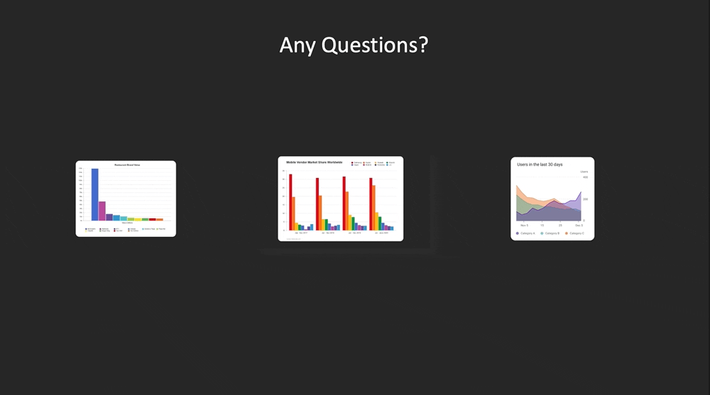
5. Zoom
A truly unfortunate and uninformative name for such a useful and unique feature. Zoom was introduced to Powerpoint shortly after Morph and has the worst name for user
adoption. One way to describe Zoom is like being able to get clickable slide thumbnails in a slide that take you to exactly that slide. It’s hard to explain
it, so here’s the official page. You can add this with Insert >> Zoom. I think this feature has a very limited number of useful applications.
Where it shines, though, is for talks that present data (tables, plots, etc. ). I’m sure you’ve all experienced or were present when at the end of a presentation, someone
in the audience asks a question that references a specific table/graphic in your talk. The presenter then presses BACK a million times, scrolling through every slide until getting to the right one, then slamming NEXT until they accidentally end the talk. Or, they back out of Slideshow mode, scroll through the slides, re-launch the slideshow from that slide. Yeah, it’s a bummer. Well, Zoom lets you live in the future because you can tile the thumbnails of the slides you expect someone may ask you about, and
when you click them, the slideshow skips to that slide and then returns to the last slide. It’s a very clean process. I highly recommend this.
Real-world examples
Nice fluid headings
The first expands on the Morph example with circles. This was a prototype/proof-of-concept for a friend.

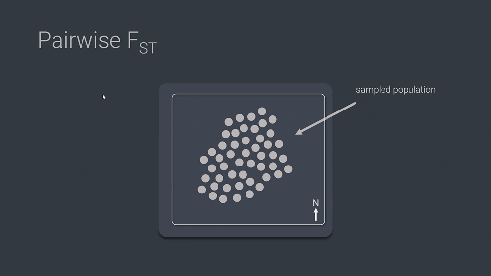
Explaining tough concepts
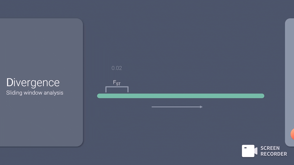
As a population geneticist, I often need to explain what FST is, along with how to read some niche plots, so I use morph to get these concept across.
Advanced Morph-to-GIF
To explain a sliding window analysis without animations and clicking through a bunch of slides, I used Morph to make a 6-slide animation of the idea, which was exported
to a video, converted to a GIF, and added back into the original presentation as an animated infinite-looped graphic.