Let’s make a graphic!
As I’m hoping you’ve already read, I talk a lot about making your own graphics. Well, to supplement that, I want to include a brief tutorial on how to make the “minimal” style graphics that I use for my own work. This is done entirely in Inkscape (free and open source!), and working with only my laptop’s touchpad and taking all the screenshots, this took me me just about 45min to make. Hope it helps! For brevity, I can’t cover all the possible topics and I don’t have the time to create and edit a time-lapse video of making it, so let’s give it a whirl!
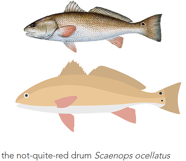
Let’s make a Red Drum
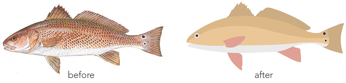
Doing a basic online image search for Scaenops ocellatus (red drum), I chose this image on the left to start with. The graphic you see on the right is the end-product.
note: for the purposes of this tutorial, I use the Illustrator keyboard bindings preset in Inkscape out of convenience, which is not the default. You can change this easily in Settings, or use the default keybindings (but be aware the letters V, A, and I will not do the same things).
Plan it out
Sure, it looks pretty easy (and it mostly is), but to make something simple out of something complex requires a little bit of planning to map out what you want to include, which saves time downstream.
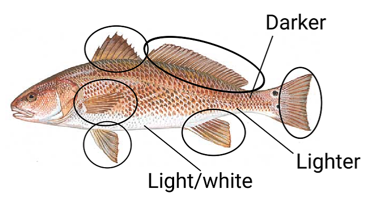
I don’t actually make all these notes, but what you see is pretty much how I plan it out in my head. The fins will be separate, the tail will be separate, and the body will be done in three sections, the white belly, the mid-colored middle, and the darker top.
Make some “paths”
In Illustrator, this is the Pen Tool (P), and in Inkscape, it’s the Draw Bezier Tool. If you’re using Illustrator shortcut configs in Inkscape like I do (in the Preferences menu), the keyboard shortcut is also (P).
How it works: A path is a series of points connected to each other by lines. To make these, you pretty much start drawing a polygon by clicking to make a point, then moving your mouse to another area and clicking there. The software connects those two points with a line segment, and you just keep going. To close your polygon, make a point on the first point you started with. A great video tutorial on making paths can be found here.
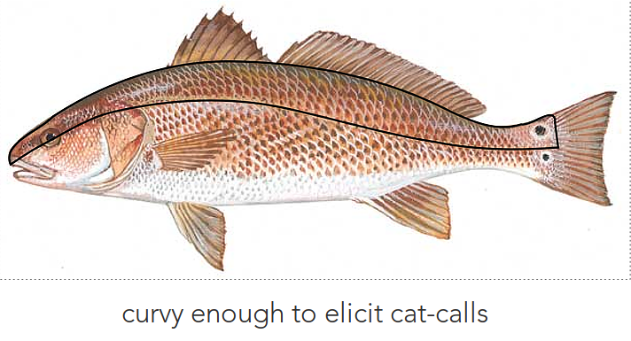
I started with the top part of the body, so I started at the snout and followed the contours of the body using this (P) tool until I made it all around and closed it on my original point.
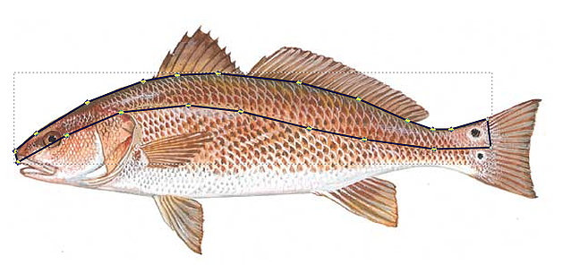
You’ll notice it looks blocky, but that’s normal. No worries! Also, since I’ll be making additional polygons for the mid and bottom of the body, I didn’t need to waste time by outlining the entire body, just the part I planned on being darker.
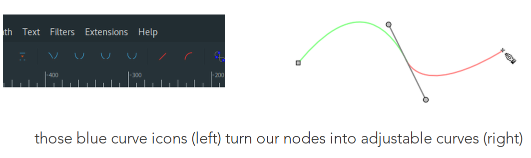
Get curvy
We don’t want blocky bits, this isn’t geometric art. So, using the Node Select Tool (A in Illustrator) or (F1 in Inkscape), highlight all the points you made, and click the icon towards the top that makes them curvy and symmetrical. Depending on how intuitively you outlined the image, it might line up really well, with only minor tweaks. You’ll notice that once you make them curves, little “arms” will stick out from your points. These are called handles and you use those to shape your curves. Here’s that path we made above, with the points (nodes) converted to curves, and shaped to how I want it.
Rinse and repeat
Well, that wasn’t too bad, was it? If this is your first time messing with vector images, it might be a little confusing or overwhelming. But, fret not! Once you get over the hurdle of understanding what nodes, handles, and paths are, it’s pretty easy to bend them to your will (all pun intended). For the rest of this image, you just need to keep making paths for the remaining body parts you mapped out.
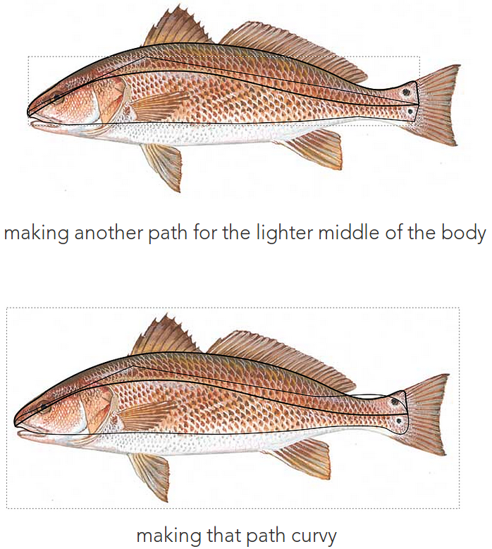
Here, you’ll notice that the top of the new path looks like it’s all wrong. But, it leads me to my Pro-Tip: like powerpoint, image editing software arranges items in ordered layers. To exploit this feature to save time, since you’ll have overlapping paths, you don’t need to outline every single detail.
In the fish above, since the darker top path already outlines the contour where the colors will be different, I don’t need to spend time outlining that contour again when I made the mid-section. All I’ll have to do is make sure the top path overlaps the mid-section and all will be well with the world. If this doesn’t make sense now, it will later. Promise!
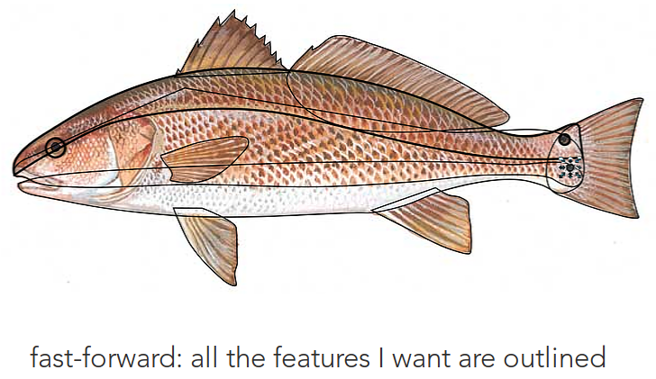
It might look a little hectic, but once you color it in and adjust what is above/below what, it’ll all come together.
Add some color
To color the paths you made, you can click on them with either (V) or (A) in Illustrator and select colors from the bottom left color swatches, or use the eyedropper (i) to pick a color from the image you’re using as reference. In Inkscape, you can select your path and use the Fill and
Stroke dialog to color them in (I’m not much of a fan of the swatches on the bottom of the screen), or the eyedropper tool like in Illustrator.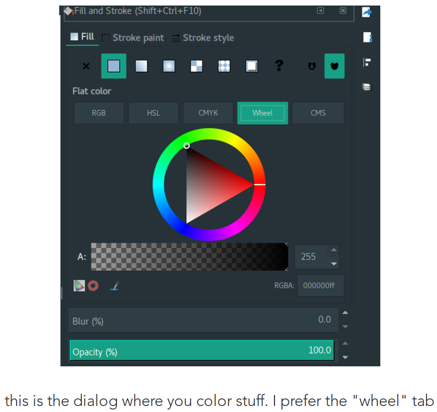
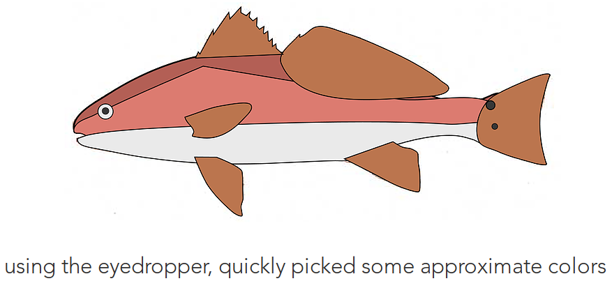
Now it’s starting to look like something! You’ll notice we’ll still need to change the overlapping order, but that’s a problem for future-us.
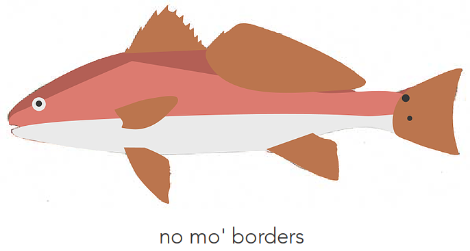
Say no to borders
My preferred style has no borders. In both Illustrator and Inkscape, outlines to things are referred to as “Stroke,” so we need to get rid of it. In both software, you need just set Stroke size to 0. In Illustrator, that will be on the top left when you have your path selected. In Inkscape, that will be in the Stroke and Fill dialog, under the Stroke Style tab.
Stack objects correctly
It’s looking like a fish! But we aren’t quite there yet. The dorsal (top) fin needs to be moved to the back, and so do the bottom two fins. We also need to move the mid-section beneath the darker top section.
Illustrator: Layers tab will order everything you have. You can drag and drop things in the order you want them.
Inkscape: Objects dialog will be the same as above
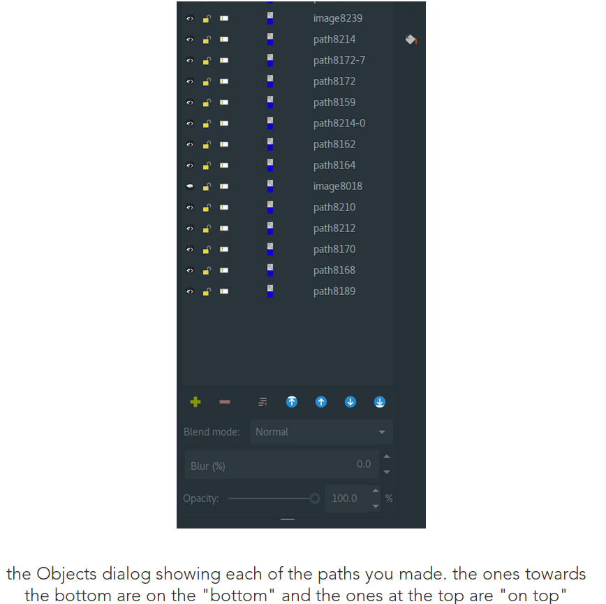
Clicking on either an object onscreen or one in the dialog box will highlight both, giving you a sense of what is where. You can drag and drop objects in that dialog box ,or use the blue arrows at the bottom for the same effect.
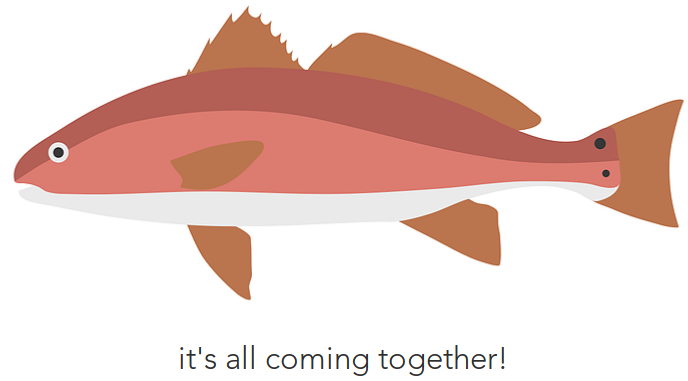
Final touches
Once you’re at this point, it’s up to you how you want to go about polishing it up. I make sure everything is lined up correctly, fix up certain features, etc. In this case, since red drum aren’t actually red, I used a different drawing to reference the colors to use for this graphic.
There you have it! I cannot stress how readily available and easy to understand online tutorials are for these software. I know I kind of rushed through some of this, but the overview is here. If you don’t quite understand how we got to this point, I suggest looking up a tutorial for bezier making, and one for coloring. Those two fundamental skills should take less than 20 minutes to figure out. Good luck!