At conferences, you either present your work in the form of an oral presentation (powerpoint + speaking) or as a poster. While I cannot enforce what I consider good presentation skills, I can however try to encourage others to improve the visual elements of their presentations. I’ve seen lots of good talks and posters marred by awful graphics, maps, organization, wordiness, or a slew of other things that just makes the process of absorbing new material needlessly agonizing. Hopefully, by reading the material below, you [the reader] can put additional consideration into the visual elements of your work. Learning new software and being meticulous about design takes up precious time, but as a scientist, I feel you have a duty to make your work approachable and accessible to both scientific and non-scientific communities.
Install software
- and learn the basics
Want to edit photos to remove their backgrounds? Adobe Photoshop or its open-source counterpart GIMP. Want to create sleek and clean graphics as vectors (and export as rasters)? Adobe Illustrator or its open-source counterpart Inkscape. If you are part of a university, chances are they have an account for
Adobe products, so you can use those through the university. Otherwise, both GIMP and Inkscape are plenty feature-rich to handle the stuff you need. I have been an ardent user of Adobe for years, and switched to GiMP/Inkscape in one afternoon. Been using the FOSS alternatives exclusively for 6 years and have never felt the need to go back to Adobe.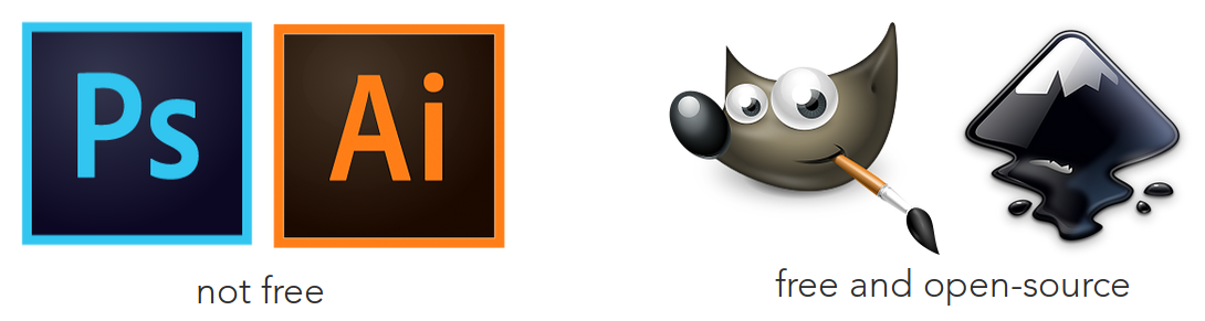
Also, and I can’t stress this enough: the internet is your friend. use google, youtube, and read tutorials like the fantastic site pixls.us that only uses open-source software
You certainly don’t need a Wacom tablet to do this stuff; I only recently purchased the cheapest one (to reduce wrist strain) and half the time I use my laptop’s touchpad anyway. The interfaces can be intimidating at first, but I barely use 20% of all the features, so don’t panic in thinking you need to know everything to work with this. If it’s any consolation, I’m entirely self-taught.
so maybe you aren’t artistic…
Follow the pros
- for inspiration
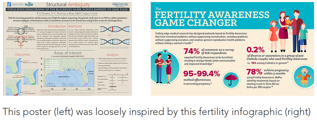
Draw inspiration and ideas from the media around you. And I mean from all sorts of places. Many of my posters and presentations have been inspired from fliers for music festivals, concert fliers, infographics, or advertisements. If you want something to look good, looking at other scientific posters probably isn’t going
to help all that much. Instead, look at stuff professional graphic designers were paid to do. Believe it or not, they are better at this than we are. Here’s a real-life example:
Remove backgrounds
- use .PNG, .SVG, or .TIFF format
Everyone knows what a .JPG/.JPEG is, but you shouldn’t really use one in a presentation. JPEGs don’t allow for transparency, which means your image will always be rectangular, and always have a background. Sure,
some photos are a real pain to remove backgrounds from, but the results are almost always worth it. If you need super hi-res stuff, I would prefer .PNG over .TIFF because TIFF filesizes are gigantic at the same resolutions as .PNG. I’m talking 300kb (PNG) versus 600mb (TIFF).That’s nuts. A clever trick would be to use a background for your presentations that matches the background of your photos (assuming solid color). I don’t prefer this, but it’s doable.
Either way, this leads us to the next point:
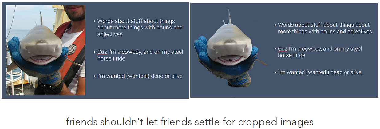
Avoid photos
- they aren’t as necessary as you might think
Just hear me out. Photos are great, and I’m sure you have some nice ones with your fancy DSLR or your overpriced iPhone. When you’re trying to convey a concept, a photo might not be as useful as a graphic. Graphics have the luxury of distilling concepts down into the the bits that will convey your point most effectively. Remember, the point is disseminating information, not showing a highlight reel of how cool you are and how awesome your life and work is. Ask yourself, how necessary it is to include this photo of you holding a shark? How does a photo of an awesome sunset out at sea from a research cruise supplement a slide about sampling methods? It probably doesn’t. Here’s an example of a series of graphics I made for Kady Lyons to demonstrate the changes in egg-to-embryo sizes of stingrays based on photos she took detailing exactly that.
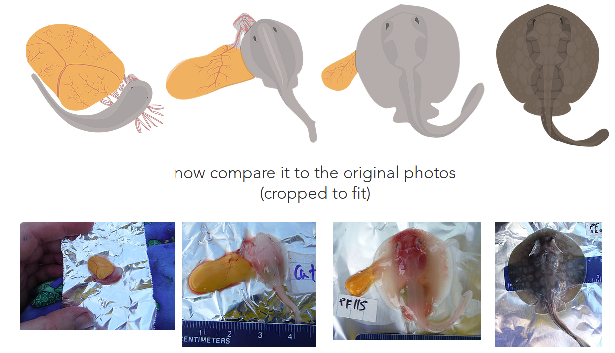
The graphics are far less busy than the photos and provide the minimum amount of detail required to get the point across. I should also mention that removing the background from these photos would be a tremendous pain. So now, instead of these photos, we have minimalist graphics without backgrounds that emphasize that body size and pigmentation are increasing, the body is changing shape, and yolk size is decreasing. Also, since you’ll be making graphics…
Be better at color
- colors matter
Use color! But, don’t use too many or jarring colors. Personally, I would avoid gradients, as they are now considered antiquated and generally unattractive. If you need help with colors, there are some resources out there, like Color Brewer. While you’re free to explore the options of Color Brewer, my preference is for Google’s Material Design. You better believe that Google spent a lot of money to arrive at that design system, and since 2015 I’ve pretty much shifted all of my work to it. It’s elegant, has a reduced palette, and
the “minimalist” style cuts down on the time it takes to make things. If you choose to follow Material Design, you have the options of using shadows or keeping things “flat” (no shadows). You’ll notice that I
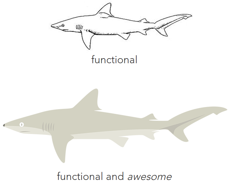
usually stick to flat, but that’s a personal choice. If you want color inspiration, just type “flat icons” into a search bar. Here’s an example of a sketch from an ID book of a blacknose shark (below, top) converted
into a Material-styled graphic (below, bottom). When I create species graphics, I typically hand-trace paths (vector-graphics term) and mold them over sketches like these. This process usually takes 30-90 minutes depending on complexity.
If you want to try it yourself, there’s another post on this site to guide you through it :)
Fonts. matter.
- they matter so much
You probably might not put much stock in fonts, but I’d like to convince you to reconsider. Fonts are a fantastic subtle way to improve a poster/presentation. Let’s get some basics out of the way: don’t use Comic Sans, Papyrus, Impact, or monospace fonts. If you must use Calibri, switch to Calibri Light. All posters and talks should be limited to at most two fonts; a serif (with hats, e.g. Times New Roman) and a sans serif (without hats, e.g. Arial). Don’t use stupid flashy or artsy fonts. If you are using downloaded fonts (such as Roboto or Roboto Slab) in a powerpoint presentation, you need to “embed” the font in order for the fonts to show up on a computer that doesn’t have it installed, such as a computer at a conference. If you are a Windows or macOS user, you can embed your fonts using this tutorial.

Words, less of them
- show more, say less
So, words, right? It would behoove you to write less of them. Poster sessions have a lot of posters hung up, and you as a presenter want to keep a listener interested and up to speed, but within a reasonable amount of time. Your poster is not a chance to display a publication verbatim on a 4’x3’ sheet of cardstock, so why would you force your audience to listen to you, nod insincerely, and have an internal struggle as they listen to you rattle on while trying to understand whatever it is you have written on a poster? That’s madness.
break the cycle
The poster from #2 (above) has a total of 4 complete sentences on it (seriously, you can count them yourself). In this way, good oral presentations and posters aren’t so different: you have to find a way to convey the most by writing the least (“pith”). For both, the things you say verbally should carry the majority of what you’re trying to get across, with your powerpoint/poster being largely supplemental. Posters, though, should still have enough on them that passerby’s can navigate and understand them without you present. It’s a tricky line to walk, but it’s absolutely doable. On the other hand, a powerpoint presentation should not be text heavy (per slide) and doesn’t need to carry its own weight since you’ll be right there talking about it. As a note, don’t do that awful thing where you read off your bullets verbatim. Bullets should be just a super short summary of what you’re saying out loud.
Case study
This is the first poster I ever made as a naive undergraduate (it’s bad, real bad):
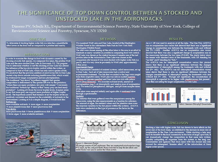
I used to be so proud of this poster. Anyway, let’s look at the missteps:
Where to even begin?! First of all, the heavy use of drop shadow is a bit much. Second, there is a lot of blue. Like, lots. The text boxes beneath figures is grey for some reason. The photos on the left have no captions at all, and are redundant considering the experimental design graphic in the center. The spacing of text within the boxes is way too tight. Seriously, why was it so important to include a photo of me doing the work? There’s a weird gap between the Results figures and the top of Conclusion. I’m also violating guideline #9 (below) by using white. Also, look at all those words! There’s just too many of them. I would hate to have to stand in front of this and read it. And lastly, there is no map of the study sites; the Adirondacks have lots of lakes in the region, so it’s unreasonable to expect anyone to know where Wolf Lake and Caitlin Lake are. Speaking of maps…
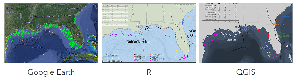
Don’t neglect maps
- nice maps are not limited to cartographers
If you’re in the life sciences or geology, chance are you’ll need to make maps as figures. First of all, do not use screenshots of Google Earth. It’s hideous, lazy, and frankly if you’ve been adhering to the previous points, it will completely clash with how clean and polished everything else is. There shouldn’t be a reason why your maps cannot look as nice as the remainder of your presentation. To make nice maps (I’m not a cartographer), you can use ArcGIS (not free), R (‘maps’ and ‘bathy’ packages, free), or my personal favorite QGIS (free and cross-platform, recommended). Most of the time you just need a map of your study area and sample locations, so at most you would be using the most basic features of GIS software. Base layers (shapefiles) are available for free online from various organizations, including NPO’s, NGO’s, federal, and state governments. A good starting point would be Natural Earth. Your sample locations are input as a .CSV file with 3 columns: sample_ID, latitude, longitude. It’s really not that hard after you play with it a little and follow some tutorials available online. Again, if it’s any consolation, I’m self-taught in using both R and QGIS for mapping. Here are the same map made using three different methods:
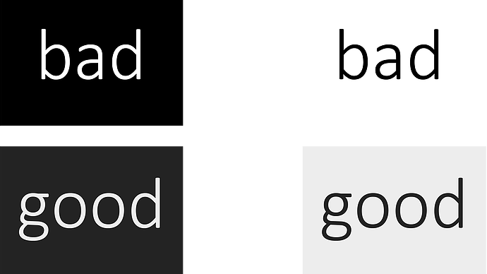
Avoid true black/white
This one is more of a personal guideline than a general one, but I feel it deserves its own section. Remember #5 (be better at color)? Well, true white (#FFFFFF) and true black (#000000) are a little jarring. In
the present era of apps and smartphones, you may not have noticed, but true-black is fairly uncommon. As such, if you want to use a variant that people find “comfortable” and “familiar,” pick a color thats close to true-white/black (i.e. a really dark grey, or really pale grey). It’s a subtle difference that won’t be noticed specifically, but will add tremendously to the overall effort. And yes, this website is black text on a white background, but that’s from laziness. No one’s perfect.